CSS
Cascading Style Sheets
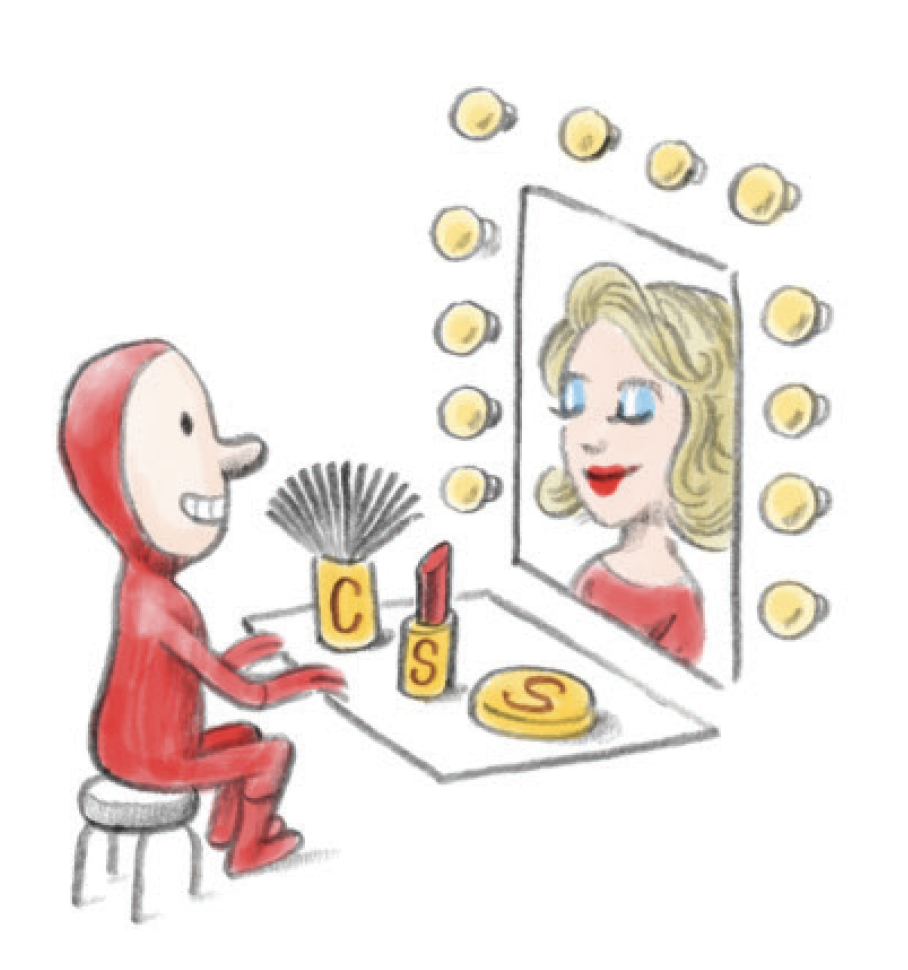
Image from 20thingsIlearned - GoogleWhat makes a Webpage?
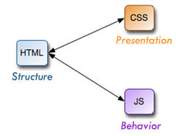
There are 3 main components to current web pages:
HTML
HyperText Markup Language is the standard markup language used to create web pages.
We use to create the structure of the page.
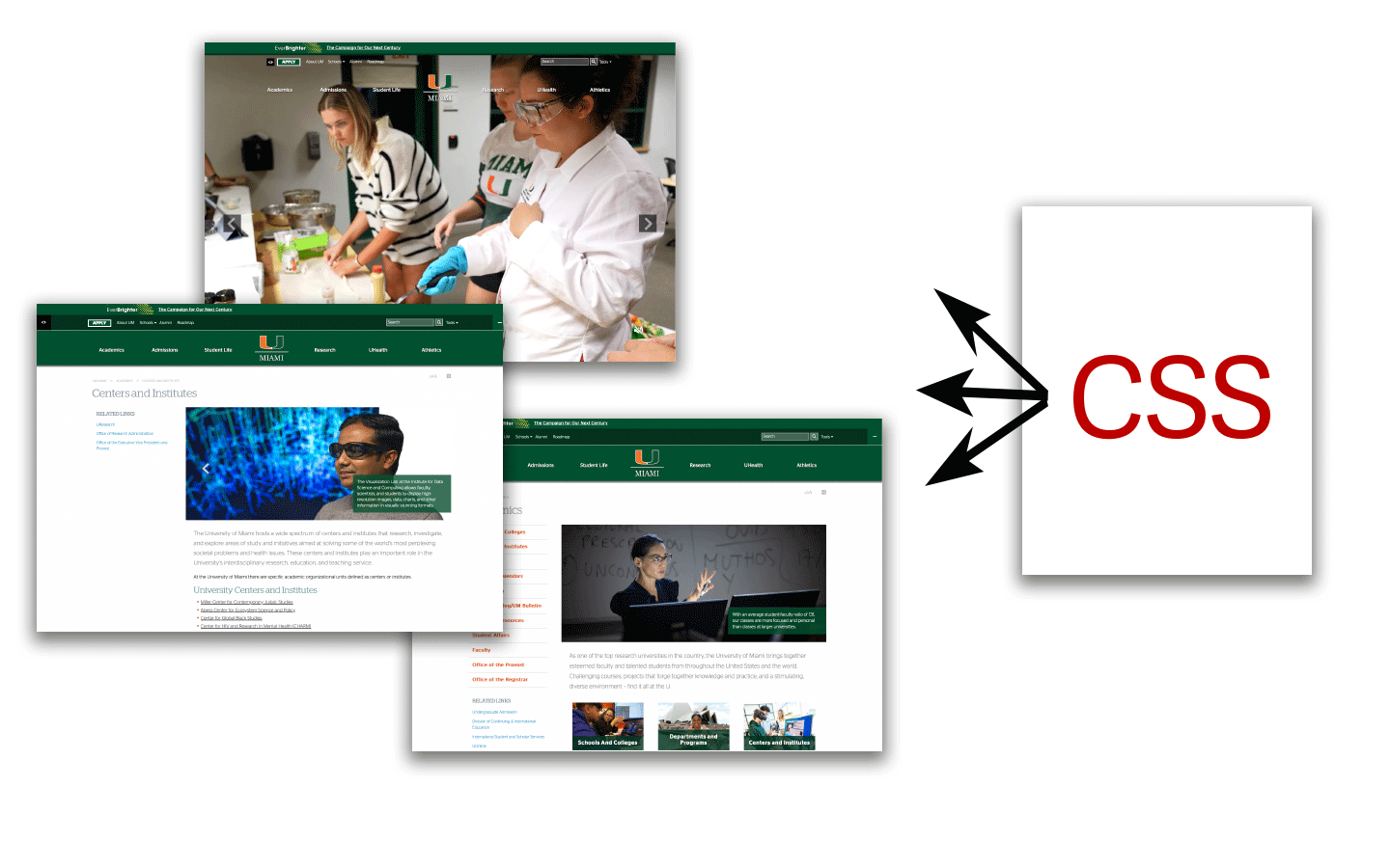
CSS
Cascade Style Sheets Is a markup for styling HTML pages
We use it to style the HTML elements.
Javascript
Is a programming language that was developed to create dynamic websites.
We use it to add dynamic functionality and interactivity.
What is CSS?
* * *
- Defines a Web page’s appearance
- Plain text file with rules for the display of HTML elements
- CSS associates style rules with HTML elements
- Separates style and content
- Formatting includes fonts and colors as well as layout and position
- Can be created outside of your HTML and applied to multiple Web pages
- Well-formed HTML is important for your CSS to work properly
Before CSS..
- Pages were styled with some HTML tags and attributes. First webpage
- <center>, <align>
- <font>, <text>
- <background>, <bgcolor> etc
- the W3C recommended CSS1 in 1996
- The first commercial browser to support CSS was Microsoft's Internet Explorer 3, released in 1996.
- Later on, all browsers offered support for CSS
- CSS2 was released in 1998
- CSS 3 is the latest standard for CSS
- CSS is evolving constantly and there are always new features coming up
How do we use CSS?
Where do we add CSS?
🤩
External File
- Better for maintainig multiple files
- Keeps structure and presentation separate
- Add link to the head section of the file
- <link rel="stylesheet" href="/css/styles.css">
😐
On the Head tag
- It is always recommended to use external styles
- Internal styles are good if you have a page with different styles than the rest
😡
Inline
- Not recommended in most cases.
- Hard to maintain
- Acceptable on HTML emails
How does CSS work?
- Imagine there is an invisible box around every HTML element
- You assign an id or a class and apply the style on the css file
- All web pages are made of invisible boxes
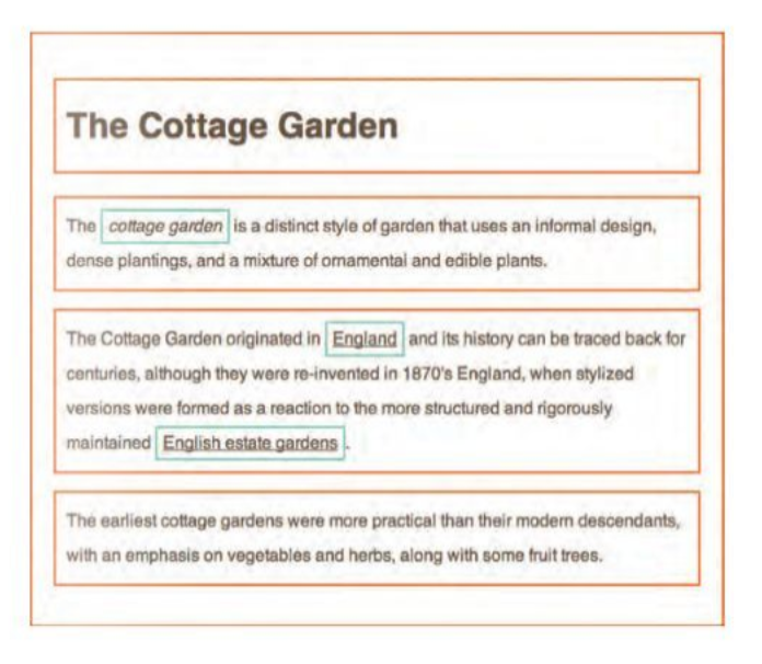
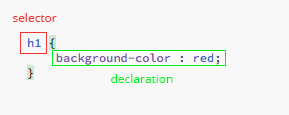
Basic Structure of CSS Rules.
Rules are made of selectors (where the style is applied to) and declarations (the attribute to apply)
- Always start and en with a curly bracket { }
- Use descriptive names for your id's and classes
- You can use underscore (_), a hyphen (-) or a letter (a-z)/(A-Z) followed by numbers
- You cannot start a class with a number
- Use hyphens or underscores to separate words
- You can apply the same properties to more than one element
CSS Declaration
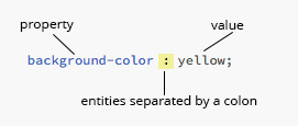
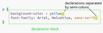
- Properties indicate the aspects of the element you want to change
- You can add as many properties as you need in a declaration.
CSS Units
-
px
A pixel is a unit of the display screen.
-
%
Refers to a percentage in relation to the immediate parent element.
-
em
An em is a unit based on a font-size. If used in fonts, it's based on the font-size of the parent element. If used in other elements, it's based on the font-size of that element.
-
rem
A rem is a unit based on the root font-size of your html document. If you did not specify a root font element, the root font will be set by the browser. In most cases is 16px.
-
vh
Stands for viewport height and it's 1% of the height of your browser window.
-
vw
Stands for viewport width and it's 1% of the width of your browser window.
The Box Model
Each box can have padding and margin. The default value is 0 unless it has a
pre-set browser style.
(e.g.: paragraphs and headings have default margins.)
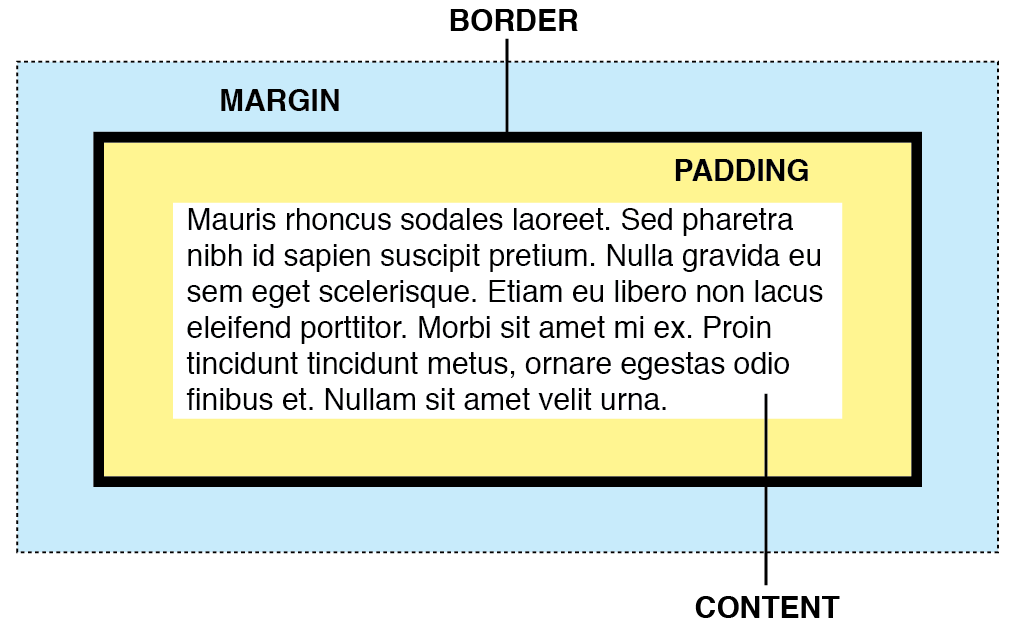
Each box has the following components
- Content: The text, image or content inside the box.
- Padding: The space between the content and the border of the box.
- Border: The edge of the box
- Margin: The space between the box and surrounding elements.
- By default the box will take the dimensions of the content
- You can specify the dimensions using px, %, or ems.
Margin or Padding?
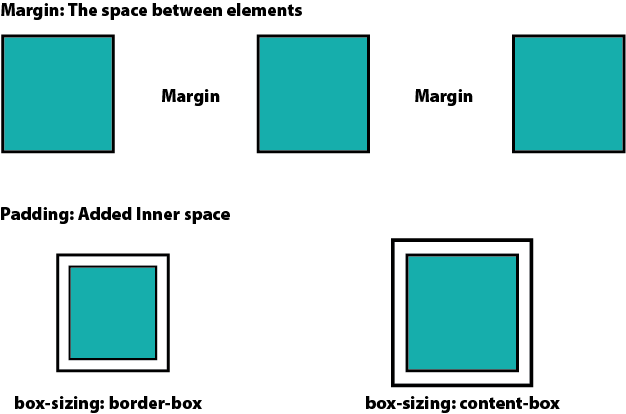
Depending on the box-sizing settings, the padding will be added to the inside or the outside of the element
box-sizing: content-box (padding expands the size of the element)
box-sizing: border-box (padding does not affect the size of the element)
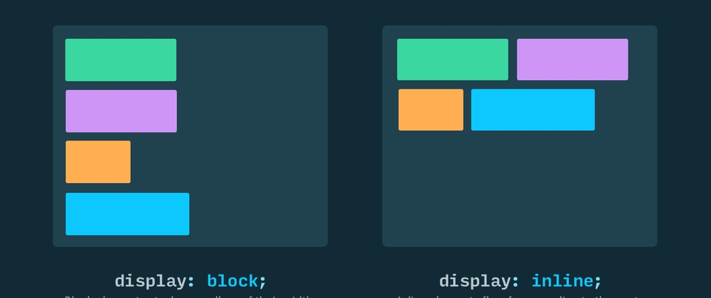
Block or Inline
In CSS, elements have one of two main display properties by default: block or inline.
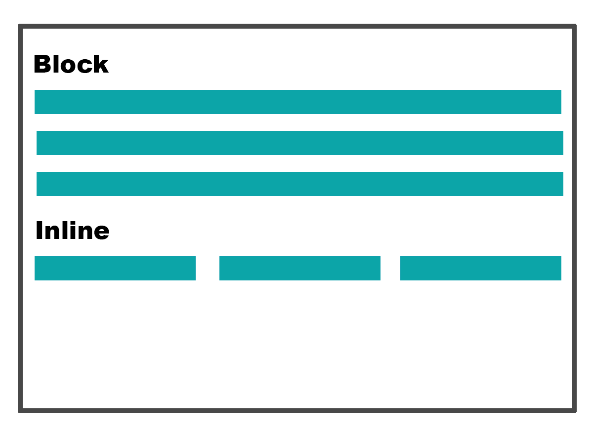
- Block: The element will take the full width of the parent container and will start in a new line. (h1, p, div). Block Elements stack on top of each other vertically.
- You can apply properties like width, height, margin, padding and border, to block-level elements.
- Inline: The element will only take the space of its content and will not break the flow of content by creating a new line (b, i, span)
- Properties like width and height will have no effect. Margin and padding will only work horizontally.
Inline-Block
Inline-Block makes block elements behave like inline elements, but with the properties of a block element.
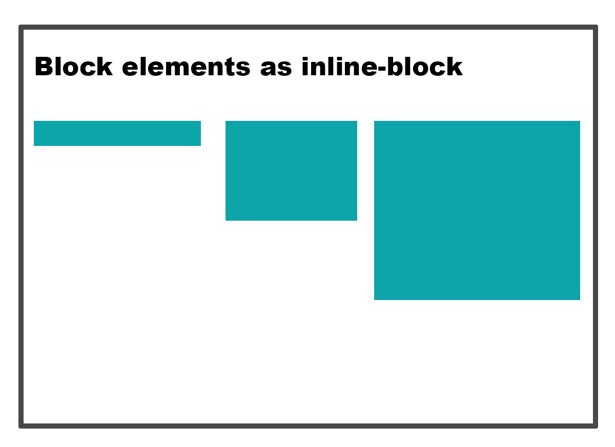
- You can apply properties like width, height, margin, padding and border, to inline-block elements.
- The element will only take the space of its content and will not break the flow of content by creating a new line.
- Use inline-block when you want elements to flow horizontally, while keeping block level styling properties.
What about Images?
Images in HTML behave by default as an inline-level elements.
Images are a special case. They are by default inline, but have many properties of a block.

- If you place an image inside a block-level container (div, p, etc), it will behave like a block element.
- If you place it inside an inline element (span, a), it will be inline.
- If you don't include it any other tag, it will be inline.
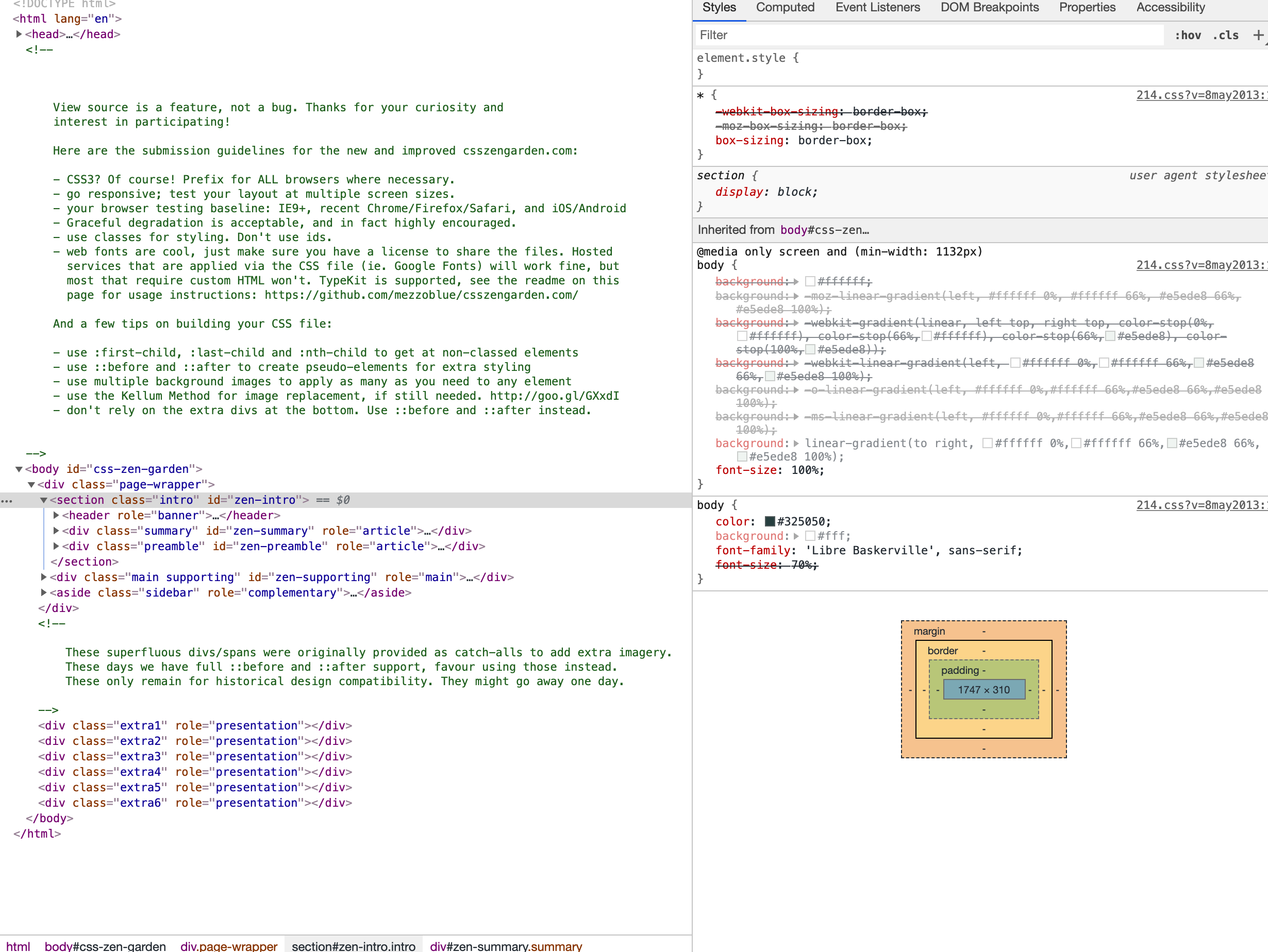
Developer Tools
Every Browser has a tool to inspect the content of a website. It's an
important tool for web developers.
The Inspector allows you to inspect and explore the structure of a web page's HTML and CSS. You can select and highlight elements on the page to view their styles, properties, and the box model. It's useful for identifying layout issues and understanding how a page is constructed.
The Display Property: Changing Box Behavior
Each box has a default behavior that can be changed with the display property.
By default every element is block or inline.
- Block: Displays each element in its own line.
- Inline: Displays the element beside the previous one. Custom height and width will be lost.
- inline-block: Makes a box element inline, retaining it's block element properties.
- none: removes the element from view.
- Flex: used to implement the Flexible Box Layout
- Grid: used to implement the Grid Box Layout
Inline vs. Inline-Block vs. Block
Each Display property has specific rules for css styling.
| Property | Inline | Inline-block | Block |
|---|---|---|---|
| Break Line | No | No | Yes |
| Padding | All four sides | All four sides | All four sides |
| Margin | Left and Right only | All four sides | All four sides |
| Width | Not Allowed | Allowed | Allowed |
| Height | Not Allowed | Allowed | Allowed |
some inline tags: a, b. img, button, span, br
Is this supported?
Modern browsers support many aspects of CSS3 but is a good idea to check support at caniuse.com
How to use Background images
How to Make Pizza

How to add the toppings
Spread the fresh Mozzarella on top of the tomato sauce and other toppings and sprinkle with basil leaves. (See photo)
Font Attributes
Below are the most common properties you can change in web fonts:
- color: Changes the font color
- font-family: Specific families go in "", and you can specify fall back options in case the font is not available ("Roboto", Arial, sans-serif)
- font-size: Use px, %, em or rem, or keywords more on font sizes
- font-style: normal, italic, oblique
- font-weight: normal, bold, light, bolder, lighter, numeric value
- text-align: left, right, center, justify (not recommended for web paragraphs)
- text-decoration: underline, overline, line-through
- text-transform: uppercase, lowercase, capitalize
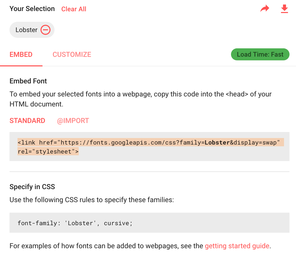
Google Fonts
Google fonts allows you to use different fonts on your website by replacing the default font family with the one you choose.
I'm a Google Font
Understanding EMS and REMS
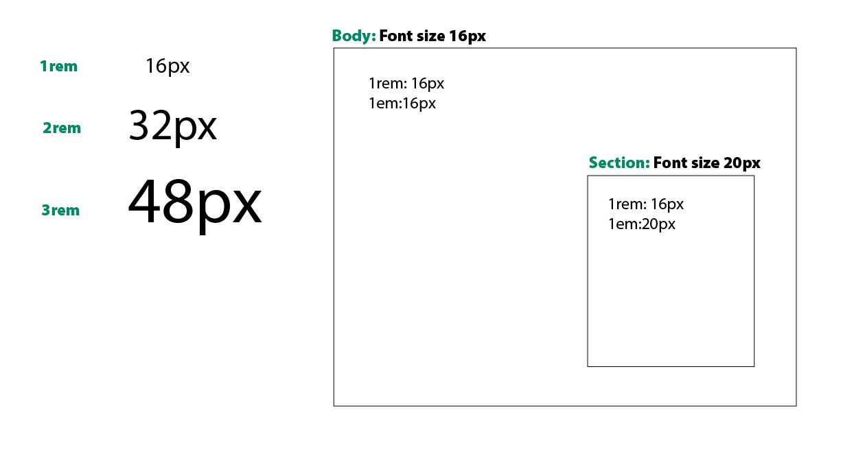
Think of px as “fixed size,” and em/rem as “sizes that scale.”
CSS: Cascading Style Sheets
What does Cascading mean?
- The Cascade is the way the browser decided which style applies to an element when style rules are in conflict.
- It goes from the least specific styles to the more specific ones.
- We can think of css rules as having weight or a point system to determine which rule wins
- Specificity Calculator
There are some factors that determine which style rule wins out:
- Initial & Inherited Properties (least weight)
- Order of Appearance
- Selector Specificity
- Origin & Importance (Most weight)
Initial & Inherited
- This is the first stop in the Cascade
- Initial applies the default values when there are no styles applied to the element.
- These are the default browser styles
- It is not really part of the cascade but it still counts as it applies styles to the html.
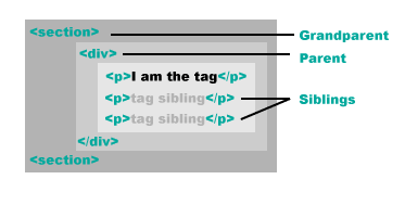
Tags have parents too!
- Inherited applies some parent styles to the children
- Not all properties can be inherited
Source Order: Last Come, First Serverd???
- Here the browser looks at all CSS selectors used in the file.
- Think of it as layers. The top layer is the visible one.
- Looks at the external, local and inline styles
- When two selectors have the same attributes and specificity, the one that comes last in the code wins.
- The order in which you link the styles also matters.
- You can say that the closest to the element to style, the stronger. (inline, in-page, external css)
Selector Specificity
- This is the third stop in the Cascade
- Here the browser looks at the selectors used in the CSS declaration
- According to their specificity the "winning" rule will be applied
The order of priority is as follows:
- Type and html selectors will be looked first.
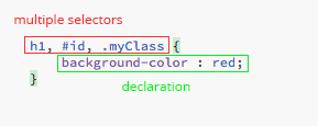
a, p, div, section, h2 - Classes will override the type and element ones.
a.myClass{} will override a{} - Id's will override classes.
p#myId{} will override p.myClass, regardless of order - Inline styles will override previous ones.
The closer the style to the element, the stronger.
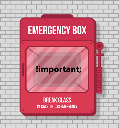
Origin & Importance
- This is the last stop in the Cascade
- Using !important at the end of a declaration overrides everything else
- Then, Origin looks at where the css rule is originated to see which one wins. (browser, user, website)
- !important is used as a last resort when all else fails.
- Understanding the Cascade
Page Paddings and Margins
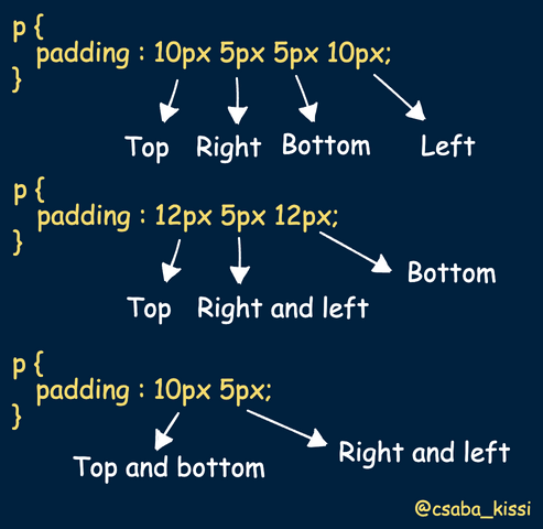
Paddings and margins have 4 values: top, right, bottom, left. You can assign the values individually by using padding-top:, padding-right, etc. Values are applied clockwise.
Overriding default browser styles
- The body has a default margin of 8px.
- p tags have a 1em margin on top and bottom.
- box-sizingdetermines if the padding will be applied inside the element, or outside. The default is content-box which adds the size of the padding to the element's size. Changing it to border-box adds the space inside the elements's available space.
- Default Browser Styles
Centering content
Centering Text:
- use text-align:center;
Centering content
- Place the content you want to center in a container (div, section, etc)
- Add a width to both divs (One will be smaller than the other)
- Add auto margin to the left and right to the inside container, and let css calculate the distance.margin: 0 auto;
This is the content
Lorem, ipsum dolor sit amet consectetur adipisicing elit. Totam earum recusandae eaque dignissimos id quas architecto blanditiis adipisci quo nihil doloribus saepe accusamus laboriosam laborum, labore iure voluptatum sapiente consectetur.
A note on Browsers
- Each browser has its own rendering engine.
- They all interpret and render web pages slightly different.
- Check this page in different browsers an note the bold text.
- They also have their own styles for default values.
- Blink – Used in Google Chrome, and Opera browsers.
- WebKit – Used in Safari browsers.
- Gecko – Used in Mozilla Firefox browsers.
- Trident – Used in Internet Explorer browsers.
- EdgeHTML – Used in Edge browsers.