
Website Layout
Using Cascading Style Sheets
What is Website Layout?
Website Layout is more than just "Design". It's how a webpage content is structured and presented to users in a way that is pleasing and easy to use.
Key aspects of Web Layout
- Content Placement: Where to place text, images, videos in a logical way that captures viewer's attention.
- Navigation: Deciding how to structure the Navigation, where to place it.
- Spacing And Alignment: Making sure that the content is properly spaced and aligned for readability.
- Organization: Making sure the page looks organized and the information easy to find.
- Responsiveness: The website needs to adapt to any screen size.
- Typography: Chosing readable fonts appropriate for the content and with a readable size and spacing.
- Color: Selecting a color pallete that aligns with the brand and content, using colors consistently and with proper contrast.
- Whitespace: Adding empty space around the elements improves readability and makes it visually applealing.
Parts of a website
Content
Call to Action
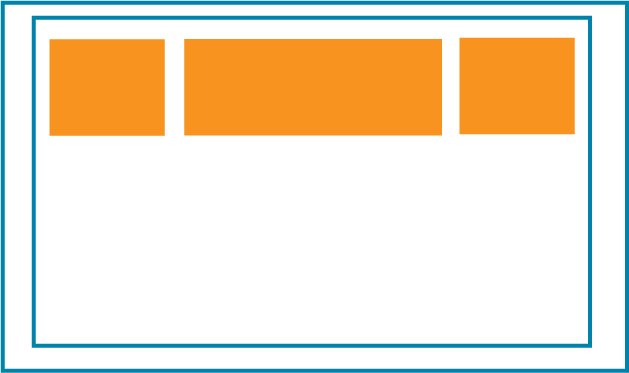
- Header: The top of the page, usually contains the logo and the navigation menu.
- Content Area: Where your main content is displayed.
- Sidebar: An optional area, can be used for multiple purposes: ads, additional navigation, events or related information that is not escential to the main content.
- Footer: Found at the bottom of the page, is used not only as a visual cue for ending the page, but also as a way to display information that needs to be accessible but is not prominent.
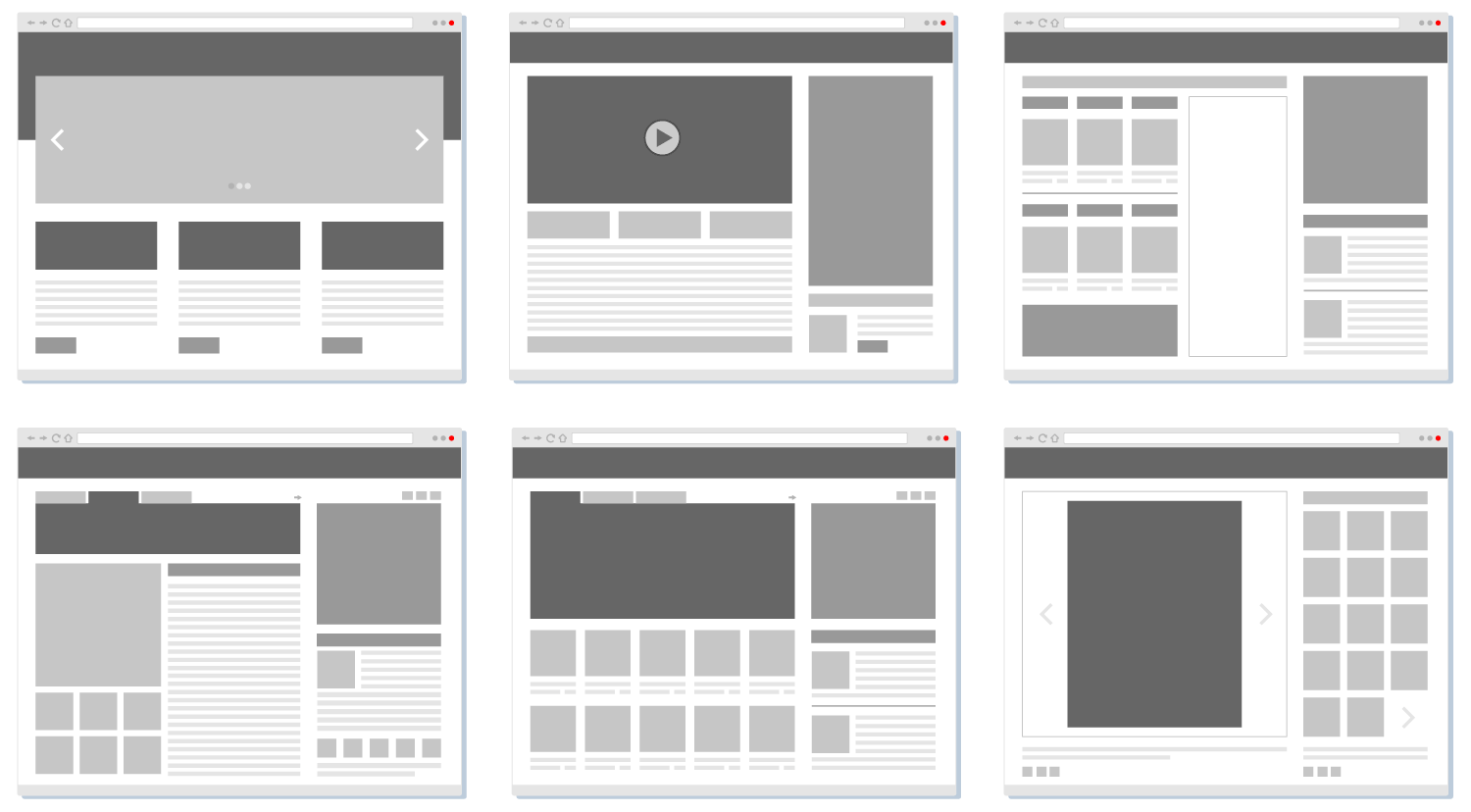
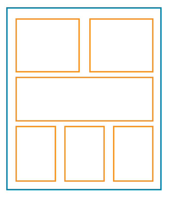
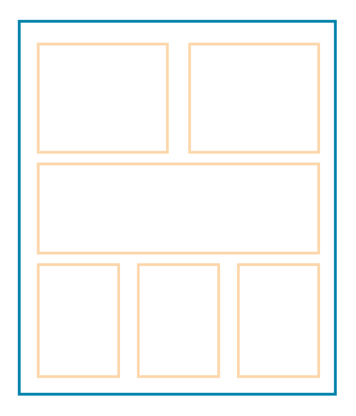
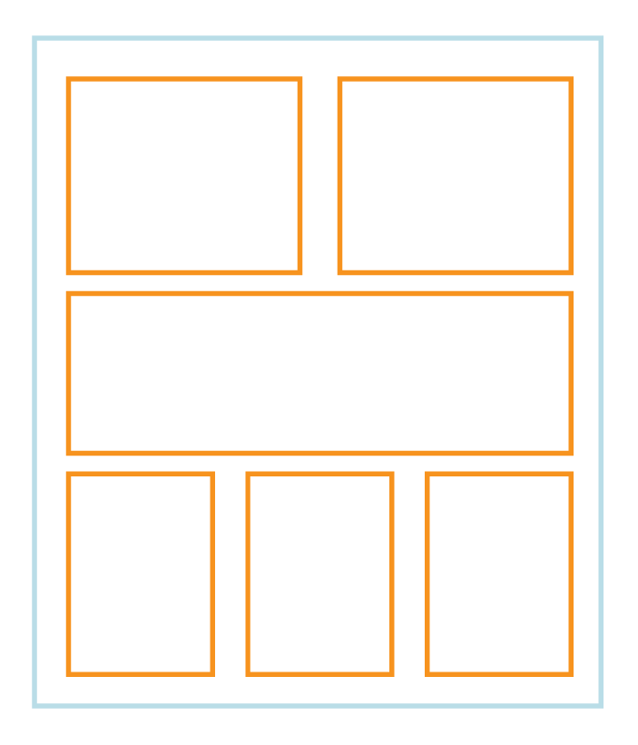
Layout examples
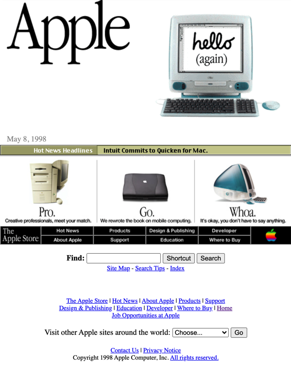
A little bit of Layout History..
- Normal HTML Flow.
- Tables.
- Positioning - Floats.
- Flexbox. Aligns elements in a single axis, either rows or columns (2015).
- Grid. Works in two dimensios. Rows and columns at the same time. (2017)
- Multicolumn (working draft as of 10/2019).
Changing Box Behavior - Display Property
Eack box has a default behavior - block or inline -that can be changed with the display property.
- Block: Displays each element in its own line.
- Inline: Displays the element beside the previous one. Custom height and width will be lost.
- inline-block: Makes a box element inline, retaining it's block element properties.
- none: hides the element by removing the space from the html flow.
- display: block; / display: inline; / display: inline-block; / display:none;
- flex: uses the flexbox model.
- grid: uses the Grid model.
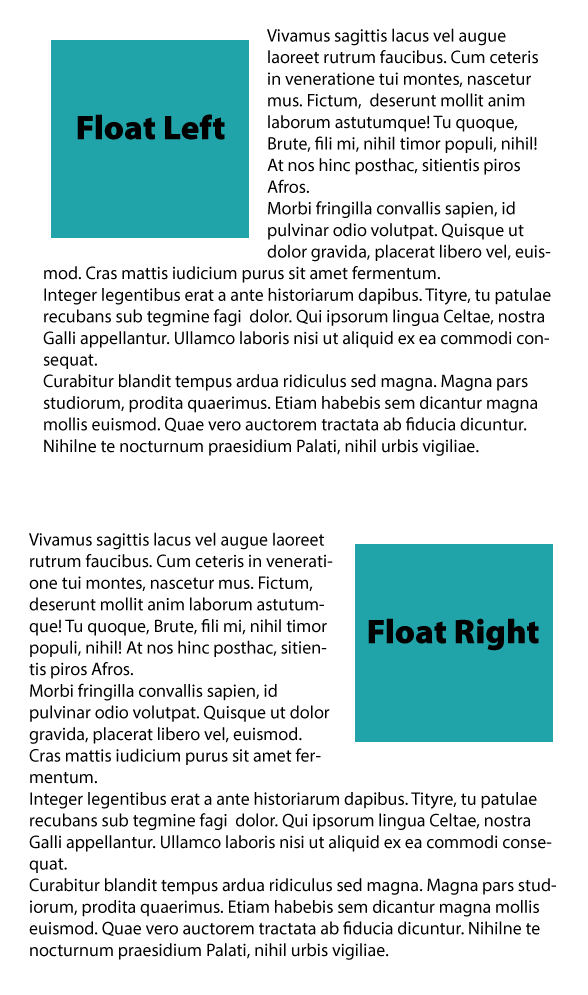
Floats
Float is a positioning property that allows one element to wrap around another.
- Previously used to make full page layouts ans a better alternative to inline-block. When floating, Elements need to have an explicit height value, and this would create problems if the content was bigger than the parent size.
- Float Values:
- Left: Floats element to the left.
- Right: Floats element to the right.
- None: It is the element's default.
- To clear the floats use display:flow-root or clear: both, left or right.
Floats are commmonly used to align text and images on paragraphs.
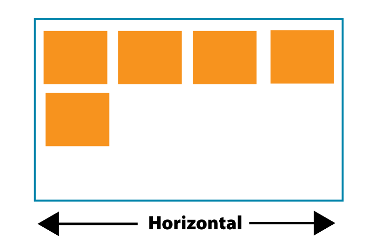
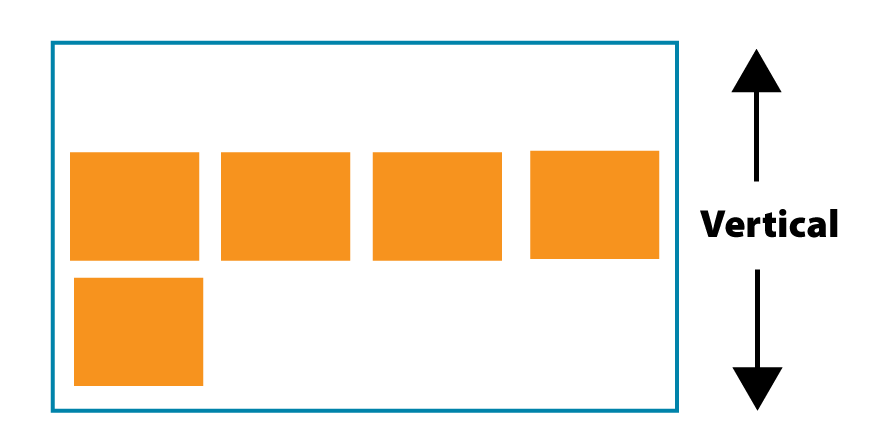
Flex - The Flexible Grid
- It's a way of creating page layouts using rows or columns.
- It aligns and distribute the space between the elements inside a container using a single axis (horizontally or vertically).
- It is faster and more organized than using floats and positioning elements.
- It distributes the elements in the available space without manual calculations.
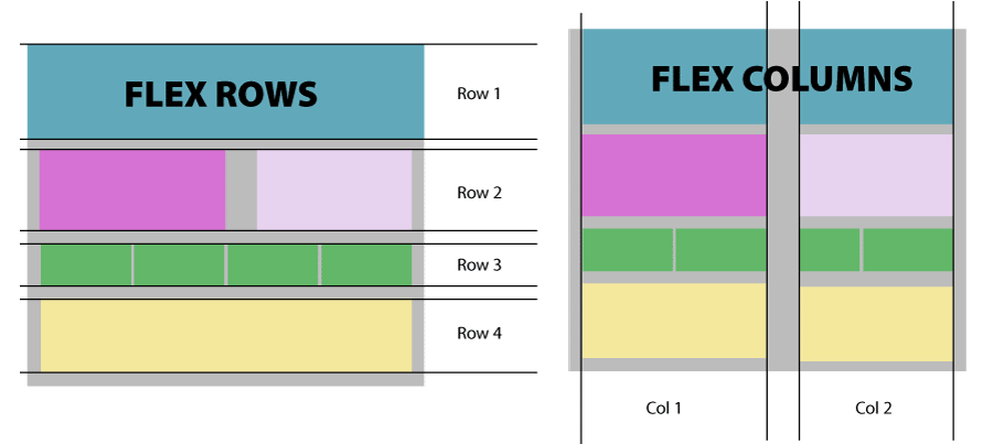
How does Flex Work?
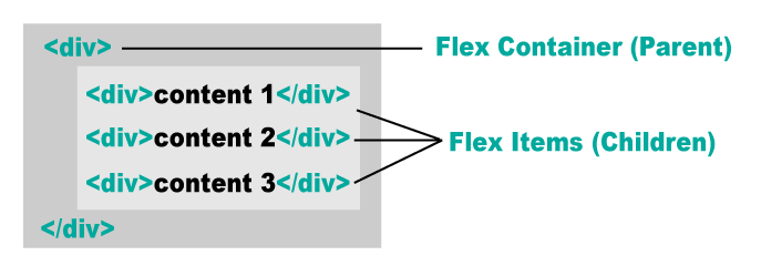
- Using the display:flex Property on the parent element, you create a Flexbox.
- The parent element is the Flex Container.
- The children are the Flex items. These items can be positioned across the selected axis.
- There are specific properties applied to the Flex Container and the Flex items.
Flex Properties
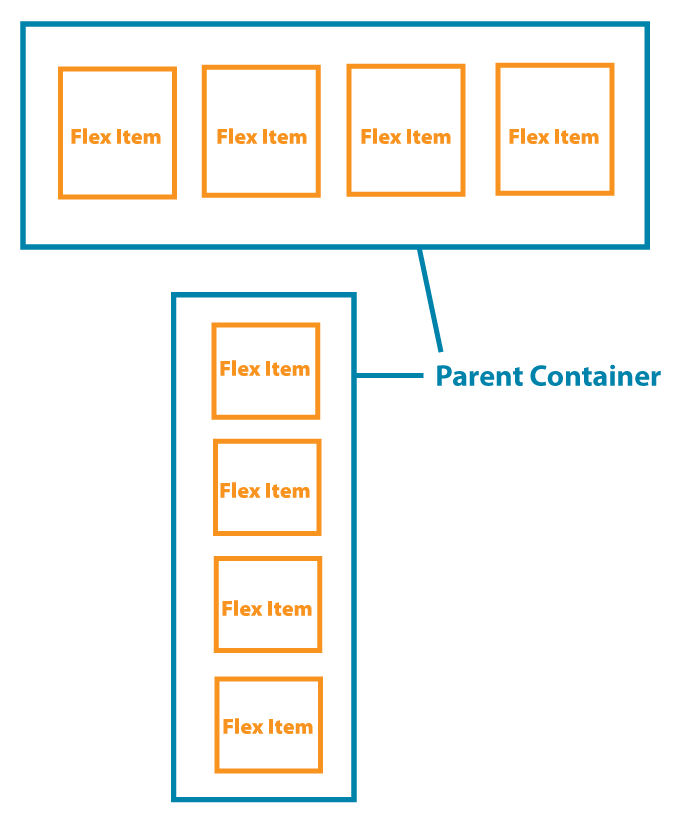
The Parent Container
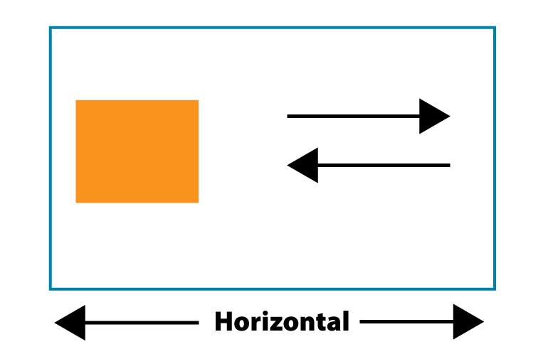
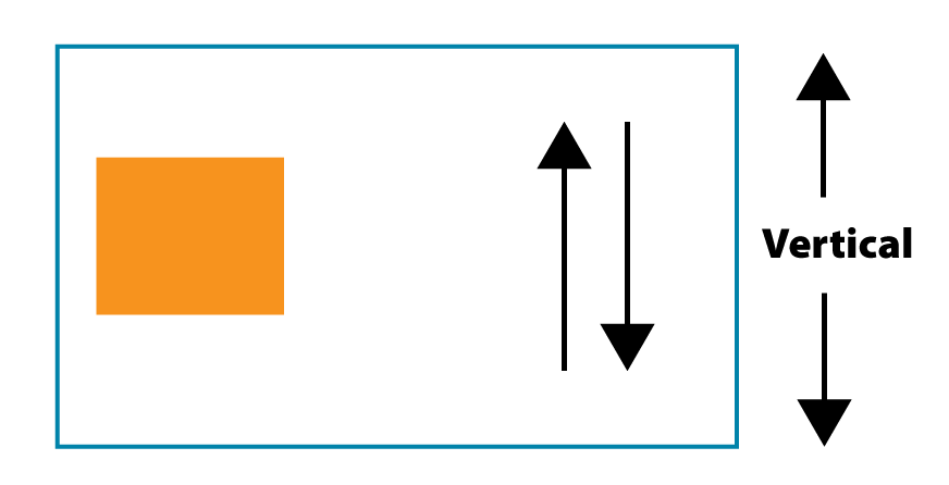
The properties applied to the parent element determine the axis in which the elements are going to be positioned. The two main properties are:
- display:flex;
-
flex-direction: row or column.
To reverse the order use row-reverse or column-reverse.
The Flex Items
- The flex items get the general positioning from the parent element, but they can also be modified individually.
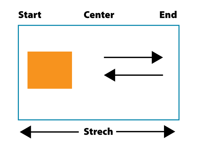
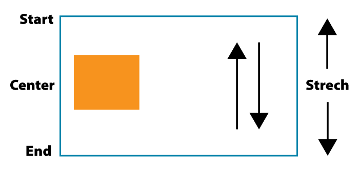
Flex Alignment
Applied to the parent, distributes the flex items inside the container.
Justify
- justify-content:
- flex-start - center - flex-end
- space-between - space-around - space-evenly
Align
- align-items:
- flex-start - center - flex-end
- strech - baseline
Flex Wrap
Applied to the parent, distributes the flex items in multiple lines as needed.
Wrap
- flex-wrap:
- no-wrap - wrap - wrap-reverse
Align (for wrapped items)
- align-content:
- flex-start - center - flex-end
- strech - baseline
Gap
Applied to the parent, adds a space between the elements.
- Gap:
- gap: 10px; (adds gap to the rows and columns)
- gap: 10px 20px; (First value adds gap to rows, second to columns)
- row-gap: 10px;
- column-gap: 20px;
Aligning Flex Items
Applied to individual flex items, lets you to override current properties.
- align-self: allows you to position individual elements
- flex-start - center - flex-end
- auto - baseline - stretch
- flex-basis: allows you to give custom width to individual elements
- uses a value (rem, , px, %). Default is auto which sizes all the elements equally unless given a width.
- You have to combine it with flex-grow or flex-shrink (1,0) in order to make it work.
Units for web
Absolute Units
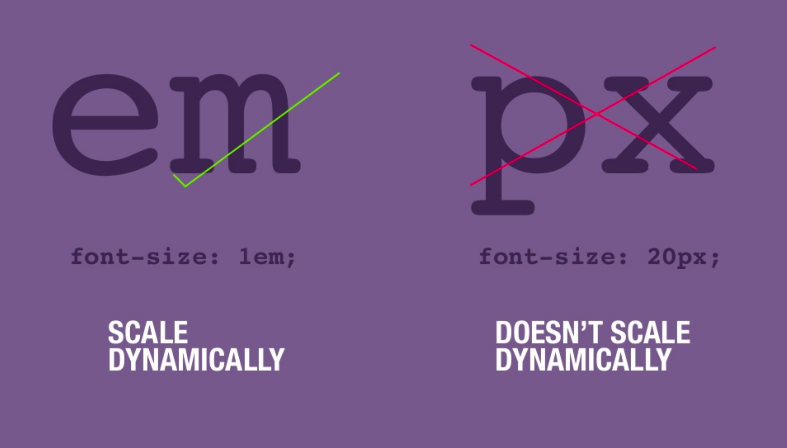
- px These sizes will stay the same regardless of the screen size.
Relative Units
- % a percentage of the parent element.
- em Ems are a relative unit based on the base font size (usually 16px) 1em = 16px
- Convert pixels to ems
- vw % relative to the screen width (viewport)
- vh % relative to the screen height (viewport)
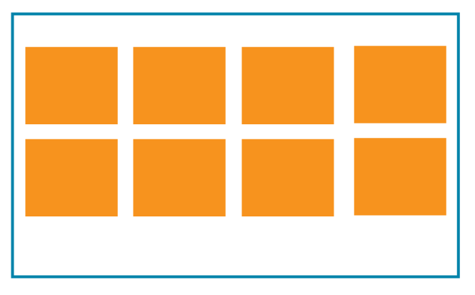
The Grid
- It's the latest and most powerful CSS layout system available.
- With the grid you can control the size and position of the "boxes" and their contents in the page.
- You can alter the visual display of the elements without affecting the semantic markup.
- You can specify the number of rows and columns.
- It's fast to develop.
- reduced code size
- Most common grid size is 12 because is easily divided by 2, 3, 4, 6
How does the grid work?
- Just like in Flex, most properties are applied to the parent element. All direct children will become a grid element.
- Column and Row count are applied to the parent container to define the structure of the grid.
- The parent container is divided in segments according to the number of selected columns and rows.
- Placement properties are applied to the children inside the grid.
Grid Structure
The Parent Container
The parent element determine the the rows and columns
display:grid;
Columns
- grid-template-columns: Determine how many columns you want to have. You can use a combination of fixed, relative fractions or auto,
Rows
- grid-template-rows: If specified, determine how many rows will be added.
Children Containers
Use them for specific positioning of rows and columns.
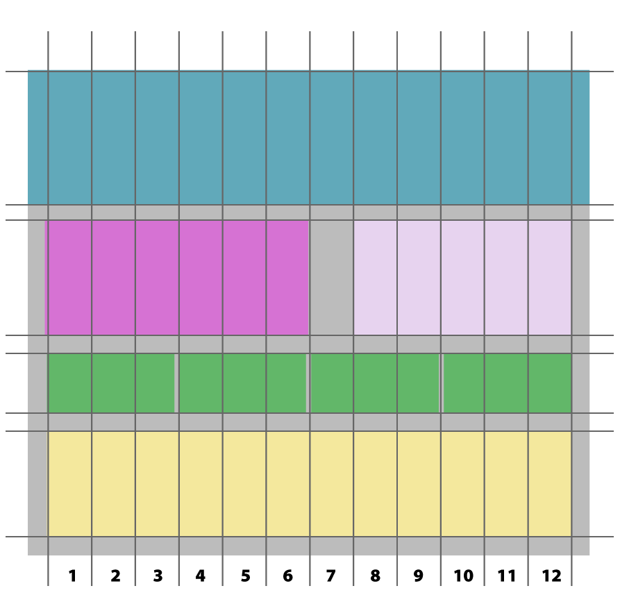
- grid-column: 1 / 13; (lines 1 to 13)
-
grid-row: 2 /4; (starts on second row to the
4th)
The Parent Container
- You can assign spacing between colums and rows:
- grid-column-gap:
- grid-row-gap:
- grid-gap: is used for column and rows
- gap: shorthand for column and rows
- Align and justify items
- align-items: start | end | center | stretch
- justify-items: start | end | center | stretch (items have to be smaller than the grid)
- If you use absolute dimensions on your items, the grid might be larger than the content and you can position the items using justify and align.
- align-content: start | end | center | stretch | space-around | space-between | space-evenly
- justify-content: start | end | center | stretch | space-around | space-between | space-evenly (items have to be smaller than the grid)
The Children Grid Containers
- Positions the elements inside the columns and span across the selected number of columns
- grid-column-start:
- grid-column-end:
- grid-column: Shorthand for grid-column start and end (2/5)
- Positions the elements inside the rows and span across the selected number of rows
- grid-row-start:
- grid-row-end:
- grid-row: Shorthand for grid-row start and end
- Justify and align individual items inside the grid
- justify-self: start | end | center | stretch
- align-self: start | end | center | stretch
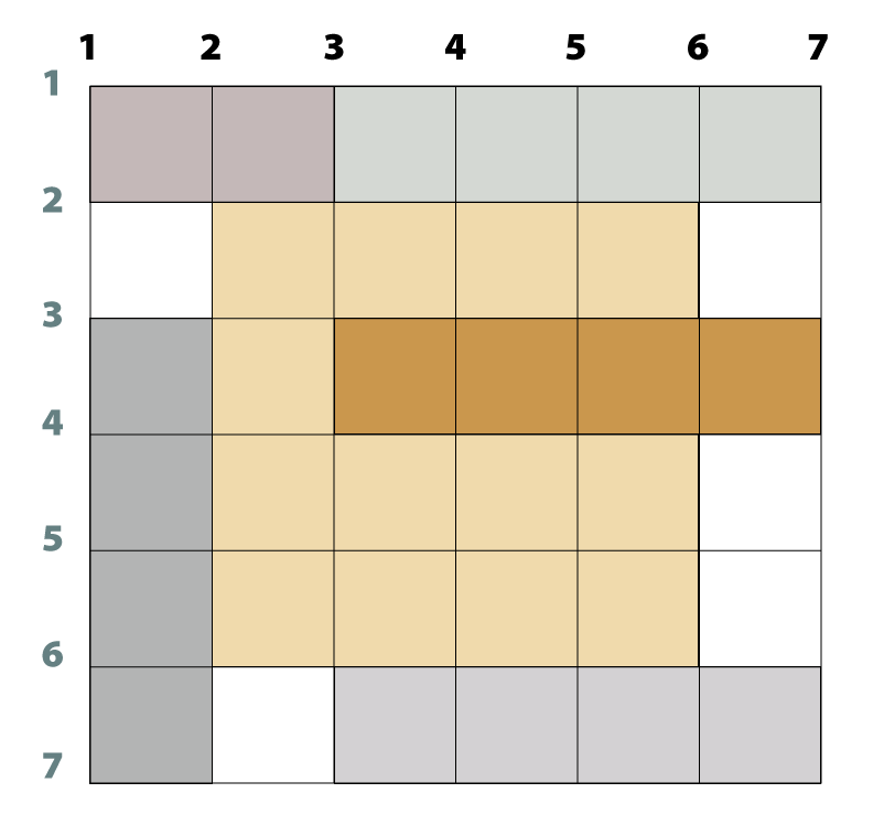
Grid Alignment
Justify
Align
Words to remember:
The following is a mini-glossary of some common terms.
- Fr: A fraction is a unith for lenght. It's a fraction of the available space.
- min-content: Represents the minimun space the content would take. In most cases is the width of the longest single element.
- max-content: Represents the width of the full content.
- auto: It will calculate the available space automatically.
- fit-content(): Fits the content within the given amount of space.
- minmax(val1 , val2): Restrics the size of the elemnt within a minimum and maximum value.
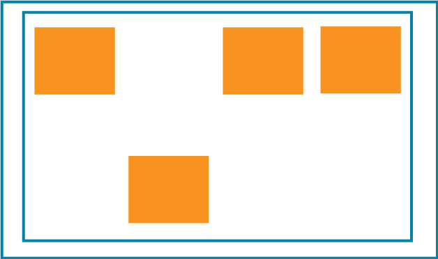
Grid Overlap
- One of the best things of Grid is that elements can overlap.
- Give each element a class
- Use grid-row and the line numbers to determine the column span.
- Use grid-column and line numbers to determine the vertical starting position of the element.
What's the difference between Flex vs Grid?
Flex
- It only works in one direction: Horizontally or vertically.
- Flex is good when you need to align content.
- It works better with simple layouts that follow a natural flow.
- Starting April 2021, it supports Gap, but it's recommended to use margin for older browser support.
- Flex works around your content.
- Great for use in horizontal navigation.
You can practice Flex placement with this game:
Grid
- You can set both directions at the same time in one container.
- It gives you more control over the layout.
- It adds a gap between the elements without having to use margins.
- It lets you overlap elements.
- Grid work with a structure and plays the content inside.
- Use grid when the layout design is more specific.
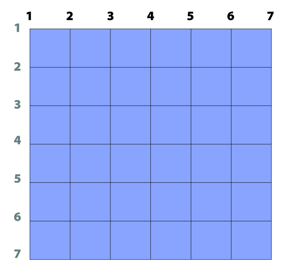
You can practice Grid placement with this game:
Which one should I use?
There is no universal answer for this question. Most sites use a
combination of both.
It all depends on the layout you need to
build, but here are some guidelines:
- Use Flex when yo want to display elements of different size automatically and there is no fixed structure.
- Use Grid when you want to control the stucture.
- If you are assigning custom widths to your elements, it's better to use Grid.
- If you are creating a simple horizontal navigation, use Flex