Web Design
Basic Design Elements and Techniques
Design is not just what it looks like and feels like.
Design is how it works. Steve Jobs
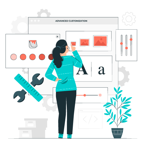
Elements of good web design.
Designing a website is not only making it look nice. It's about creating an effective experience for the user.
Whether you're building a personal blog, an online store, or a business site, certain key elements can make all the difference. Here are the most important ones:
- Easy Navigation: The navigation should be consistent and clear across all pages. You should be able to navigate across all pages from any page in your site.
- Responsiveness: The site should work well and look good in all browsers and devices.
- Consistency: There should be a sense of continuity across all pages. That include the use of the same fonts, the color scheme, and the overall tone of the page.
- Content Clarity: Make sure that the user will find and understand the information. A clear and well-structured website is always easier to navigate.
- Performance: Make sure your site loads fast and that you are not using unnecessary elements. That includes using images that are too big, or using scripts that might look good but add an unnecesary load to the page.
- Legibility: Make sure the content is readable. (color contrast, font size and style). Add enough padding to the content to avoid making the lines too long.
- Readability: Keep tone consistent with your audience and make your point quickly.
- Comprehension: Create content that is easy to read and understand. The average comprehension level for a website should generally be around a 7th to 9th-grade reading level (12-14 years old). Keep this rule, unless you are sure that your content is targeted to an audience which requires a different level. (i.e: technical papers, medical publications).
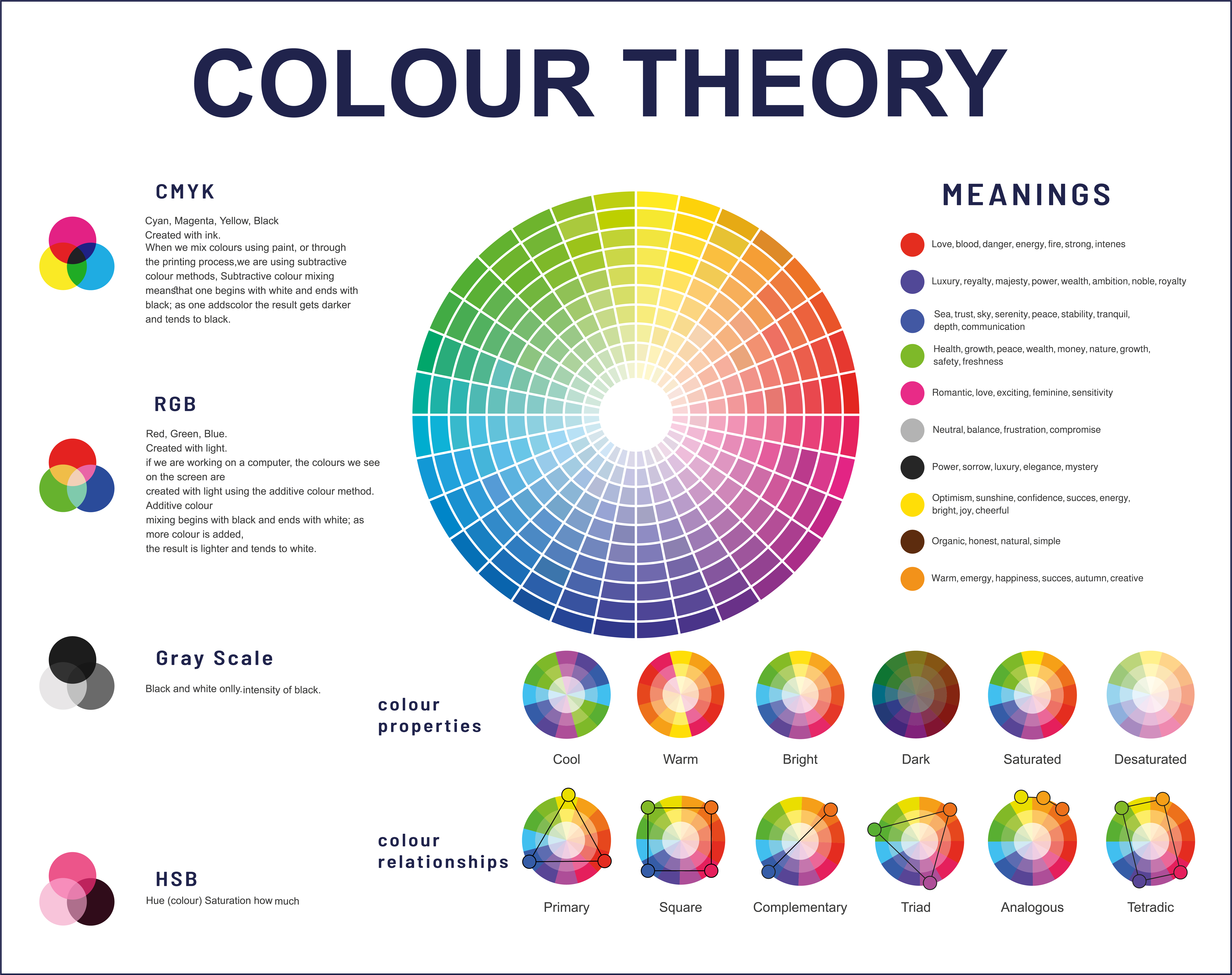
COLOR
Color is one of the first things people notice when they visit a website—it sets the mood, reinforces branding, and influences user behavior. A well-chosen color scheme can enhance readability, guide attention, and create an emotional connection with visitors.
The following video shows how you can use color to create a visually appealing website.
- Red: bold, active, passionate, lovable, exciting, and energetic. (Coca-Cola)
- Orange: sociable, happy, affordable, and friendly.
- Yellow: Confidence, logical, forward-thinking, optimistic, and playful
- Blue: security, trustworthiness, calmness, honesty, care, and strength
- Purple: Nostalgic, creative, royal and imaginative
- Green: fresh, growth, earth, natural, healthy and organic.
- Black: luxury, sophistication, authority, formal, and seductiveness.
- Brown: solid, much like the earth, resilience, dependability, security, and safety. (UPS)
- Violet: Luxury, spirituality, healing.
- Gray: Intellect, maturity, neutral.
- White: Cleanliness, nimplicity, clarity.
Color Selection
Color is one of the most powerful design elements on a website.
On average, product assessment takes only 90 seconds and between 60% and 90% of this judgment is made on the color alone!
The Color Palette
- A color palette is a combination of colors used in a design.
- A color palette can be just one color in many shades, called (monochromatic)
- You can use upt to 8 colors that complement each other.
- Pick a core color and work around it.
- You can also use an image to get a color palette.
Color Palette Generators
There are many tools that can help you create a color palette for your website. Below are some of the most used:
- Real Time Colors (See demo on the next slide)
- Coolors
- Color Space
- Adobe Color
Using Real Time Colors
This is a great tool to visualize your colors and fonts on a Real website.
Typography
Over 95% of information on the web is text. Selecting the right typography is more than just picking a stylish font.
It plays a crucial role in how users engage with and understand content online. The right typography enhances readability, guides user attention, and reinforces a brand’s identity
- Low Contrast Text: hard to read, specially if you have visual contrast issues.
- Too Wide Paragraphs: The ideal length should be between 50 to 80 characters per line.
- Too little Space between lines: line-height should be at least 1.5 times bigger than the font size.
- Walls of text: Give enough space, use multiple paragraphs and inline elements to make the text easier to scan.
- Small font size: Use minimum 16px.
- Overly Decorative fonts: Use them sparingly and for short sentences or single words.
- Using Core or System Fonts: Try not to use them. They are already overused and will make your site feel outdated.
- Using Too many fonts: Try to limit the use of fonts to maximum 2.
Font Selection.
Font selection is very important in your website. It helps set the tone of your site.
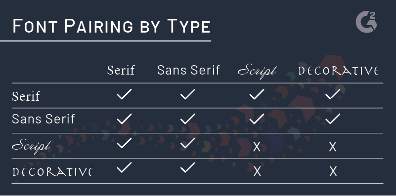
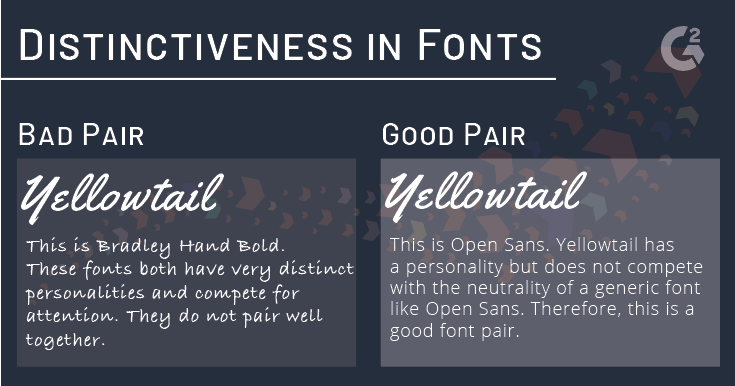
Font Pairings
- Stick to Two, Max Three Font Families. (2 is better)
- Instead of using multiple fonts, you can create variety with different weights (bold, light, etc.) and styles (italic, UPPERCASE).
- Use one font for headings and another for body text to create contrast. Headings should be bold and attention-grabbing, while body text should be easy to read.
- Avoid overly decorative fonts for body text, as they can strain the eyes.
- Google Font Pairing suggestions.
- Font Pairing best and worst practices.
Chossing the wrong font for your project can be costly
Which of the following pages for Kid Centers would you choose for your kid?
Option A | Option B
Which of the following pages for a Law Firn would you trust to defend you?
Option A | Option B
White Space, Margins and Paddings.
That white space between and around the elements in your page.
- White space helps maintain focus by driving your eye to a specific element.
- It improves visual organization.
- It improves readability.
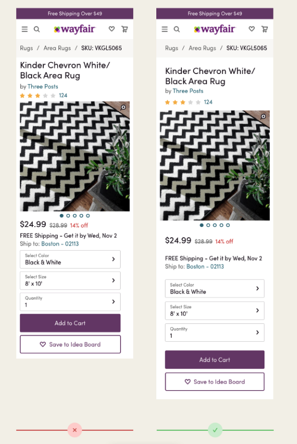
Click on the following image. Notice how on the right option, the additional space creates a clear separation between the different categories, making them easier to identify.
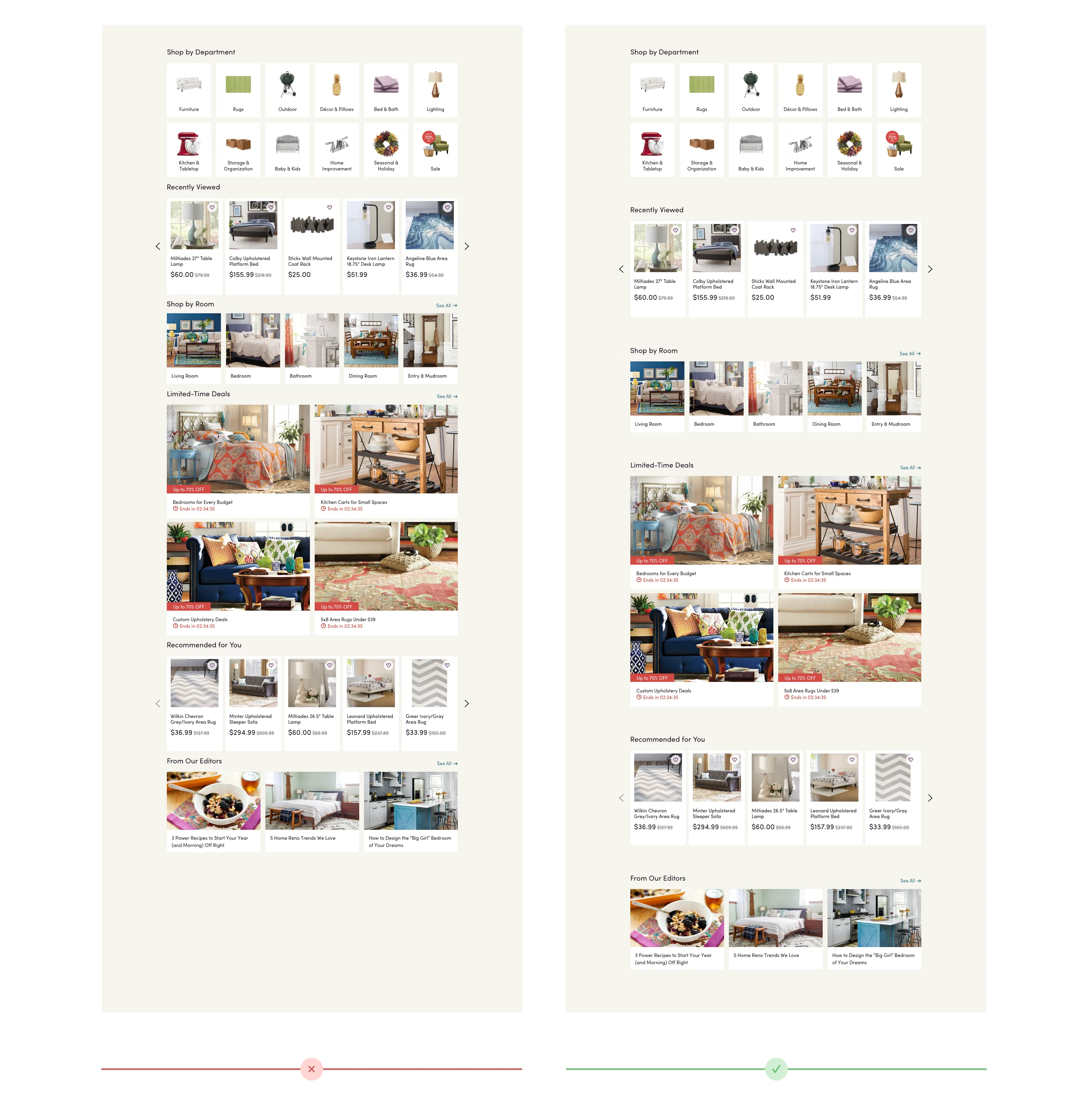
On these images, the additional space between the elements make it easier to quickly spot key elements like price and product name.
 https://medium.com/wayfair-design/more-padding-please-b95e19422acc
Your content should be readable
When designing your content, keep in mind that it can be viewed in screens of any size.
You want your site to be easy to read.
- 45 to 80 characters (per line) is the ideal line length for text on websites.
- Font size should be at least 16px.
- Line spacing should be around 150% of the size of the font.
- Dark text in a light background is easier to read.
- Columns of text without breaks are hard to read. Look at the following example: This site is hard to read.
- If you use light text on a dark background, make sure the size is big enough.
- Website Readability Guidelines.
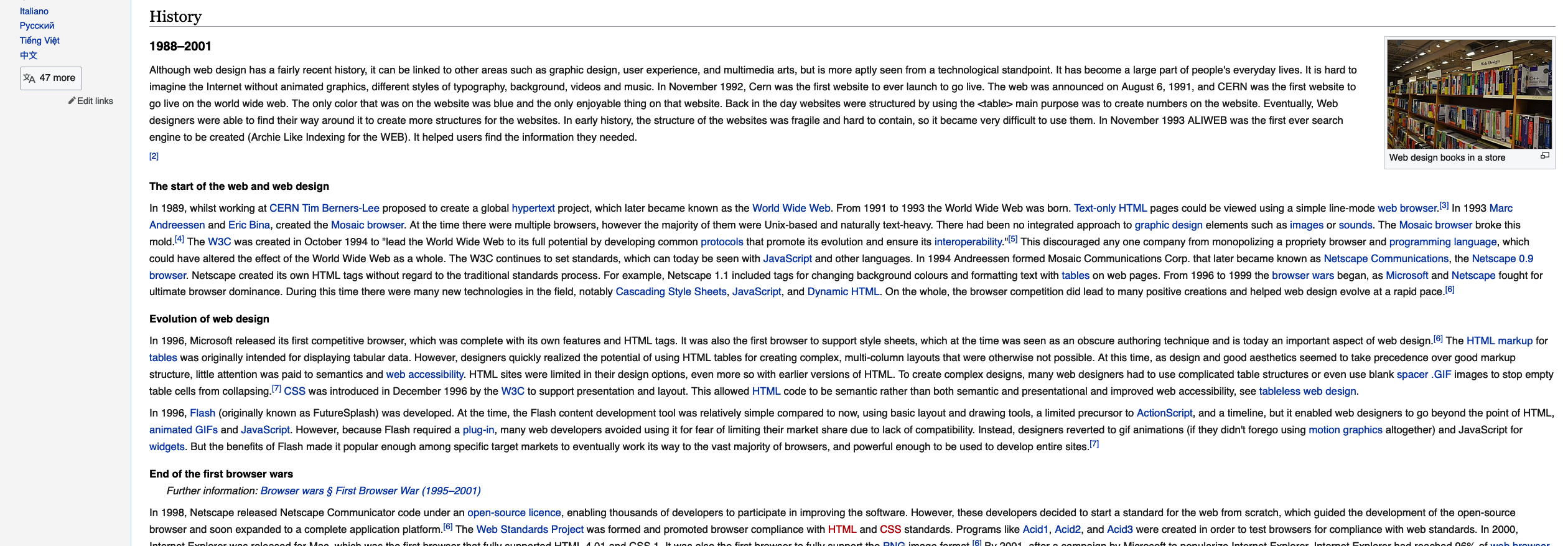
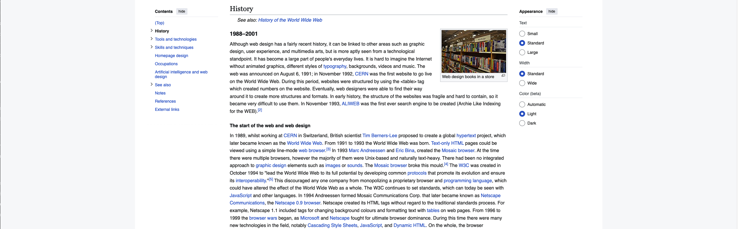
Click on the following images. The first one, has no maximum width for the content, so it will extend to the maximum width of the screen, making it hard to read, specially on wide screens.
The second image has a maximum width of 948px for the content area, which means that regadless of your screen size, the content will never grow bigger than 948px. This option is easier to read.
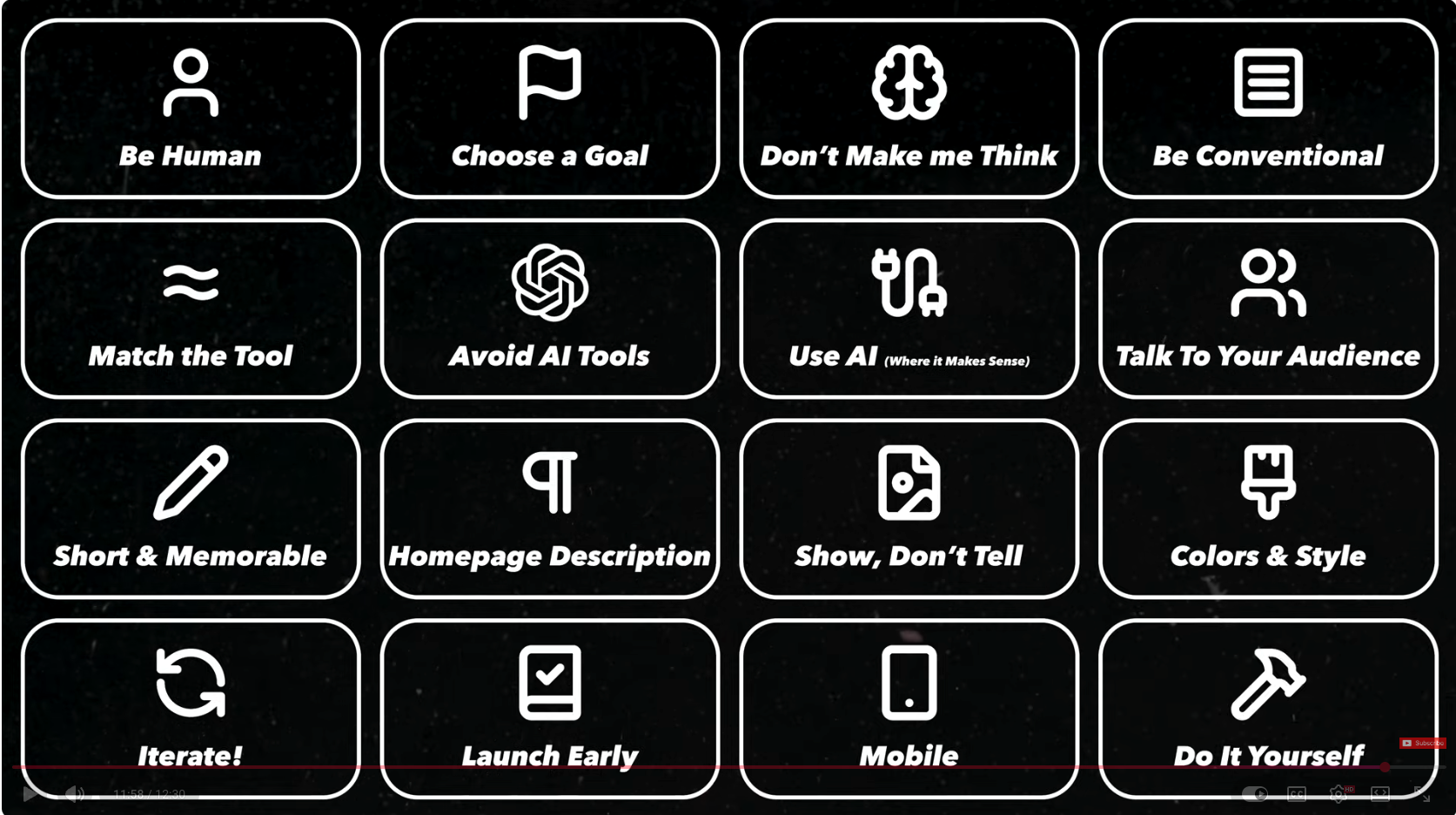
Making a website in 2026
A brief update on what's important on a website today.
Planning your site
Building a successful website isn’t just about making it look good. It requires planning, design, and a development process. Each step plays a role in creating a website that is functional, user-friendly, and visually appealing. Below, are the key stages of the web design process to help you understand how a website comes to life, from the initial idea to launch day.
Creating a Sitemap
A sitemap is a visual or structured representation of the pages on your website, and how they are going to be organized. It is a blueprint that outlines the elements you want to include in your website, and helps you organize your ideas to generate the content.
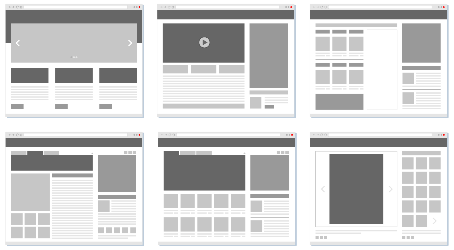
Creating a Wireframe
Wireframes are an important phase of the Website Design Process.
They are rough
sketches of a webpage where we quickly give structure to our content.
- Wireframes can be drawn by hand or created using a graphics software.
- They don't have any design elements. That will come after the layout has been selected.
- The wireframing process allows us to quickly generate many ideas before choosing a final layout.
- The purpose of the wireframe is to focus on the content, and set the website features and initial user interaction.
- Wireframes are easy and cheap to make.
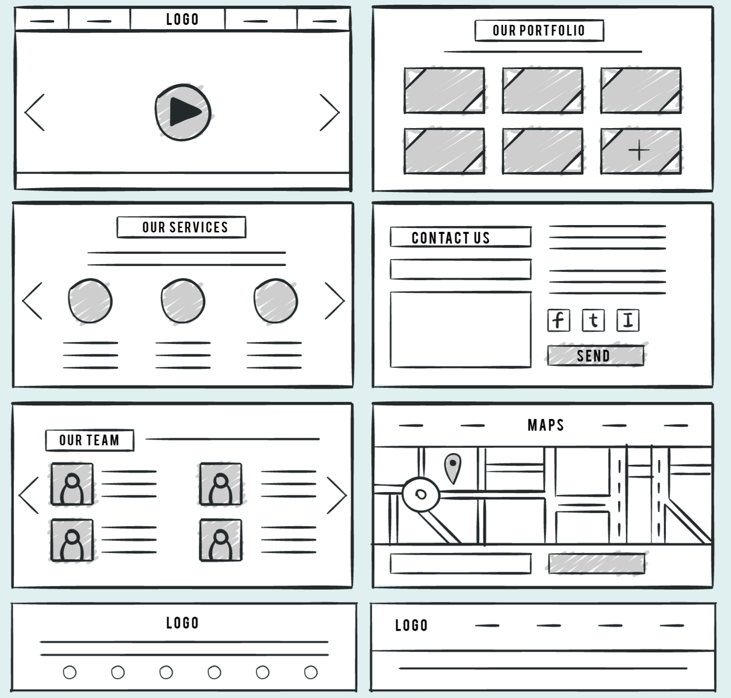
How do I create a Wireframe?
- Decide the content you're going to add.
- Start with a low-fidelity (hand-drawn)
- Include, main areas: Header, Navigation, Logo, content, Footer.
- Images are represented by boxes with an X.
- Text is represented by lines.
- Headers are represented by the actual text or thicker lines.
You can create a wireframe by hand, or using any graphic program of your choice. (Figma, Illustrator, Mockflow, etc)
Generating Content
Creating content for a website isn’t just about writing—it’s about planning, organizing, and ensuring the information is clear, engaging, and user-friendly.
One of the biggest challenges when starting a new website is creating the content. You may have a general idea of what you want to say, but structuring it effectively or finding the right words can be difficult.
In some cases, the structure is clear from the start, while in others, brainstorming is necessary to organize your thoughts.
This is where AI becomes a valuable tool, helping you refine your ideas, generate content, and shape your concepts into a cohesive structure.
University of Miami AI Tools
When using AI tools for learning and academic work, students have a choice between university-provided enterprise tools and free public versions.
Free AI tools are very convenient, but they often come with limitations, specially data privacy risks, restricted features, and potential security concerns. University-provided tools, offer enhanced security, premium features, and seamless integration with academic platforms while being compliant with institutional policies.
The following tools are available for students at the University of Miami:
If you want to learn more about these and other tools offered, you can visit the Artificial Intelligence Tools at the U on the UM IT website.
Drawbacks of using AI
AI is a great thing, but it needs to be used with some caution. Here is a list of things you should consider when using AI tools:
- Privacy: users' interactions with AI could be stored or analyzed, potentially exposing personal or sensitive information. Make sure you don't add any personal sensitive information to your chats.
One advantage of using the University recommended tools is that they have data privacy enabled and the content is not used to train the AI model. - AI may sometimes provide incorrect, outdated, or incomplete answers, as it relies on the data it was trained on, which may not always be up-to-date or comprehensive.
- You may become overly reliant on AI for answers and guidance, which could hinder the development of critical thinking and independent problem-solving skills.
- Since it generates text based on existing information, you inadvertently use content without proper attribution, leading to plagiarism issues.
- Lack of Human Touch: Empathy, emotional intelligence and cultural sensitivity may not be included in the generated content.
Brainstorming with AI
Prompts for a Website
Once you have selected the subject for your website you can prompt AI for:
- Generating ideas for content
- Generating the site structure and Sitemap
- Getting suggestions for color palletes and font pairings
- Structuring Individual pages
Sample prompts for a coffee website:
- Define the site and audience: I'm building a simple 3-page website about coffee. What are the 3 most logical pages for this site and what should each one contain?
- Identify target keywords: Based on that audience, suggest 5 to 8 keywords or phrases my content should naturally include. Explain why each one is relevant.
- Plan the structure: I'm building a 3-page website about coffee. What are the 3 most logical pages and what sections should each one contain? Keep it simple.
- Layout: Now give me a simple layout description for each page. What sections there are, how they are arranged.
- Generate content: Generate placeholder content for all three pages. Use these target keywords naturally in the headings and body copy: [paste your keywords from Step 2].
- Generate metadata: Write a page title and meta description for each of the three pages. Incorporate the most important keywords naturally. Follow the format: Page Name / Site Name.
- Color Palette: Suggest a color palette for a website about [subject]. Give me 4 colors: a primary, a secondary, an accent, and a neutral background. Include the hex codes and explain why each color fits the subject.
- Font Pairing: Suggest a Google Fonts pairing for a [subject] website. Give me one font for headings and one for body text. Explain why they work together and tell me what sizes to use for H1, H2, and body text.